Visualizing the Present and Future Using the Vast Amount of Data in Digital Space
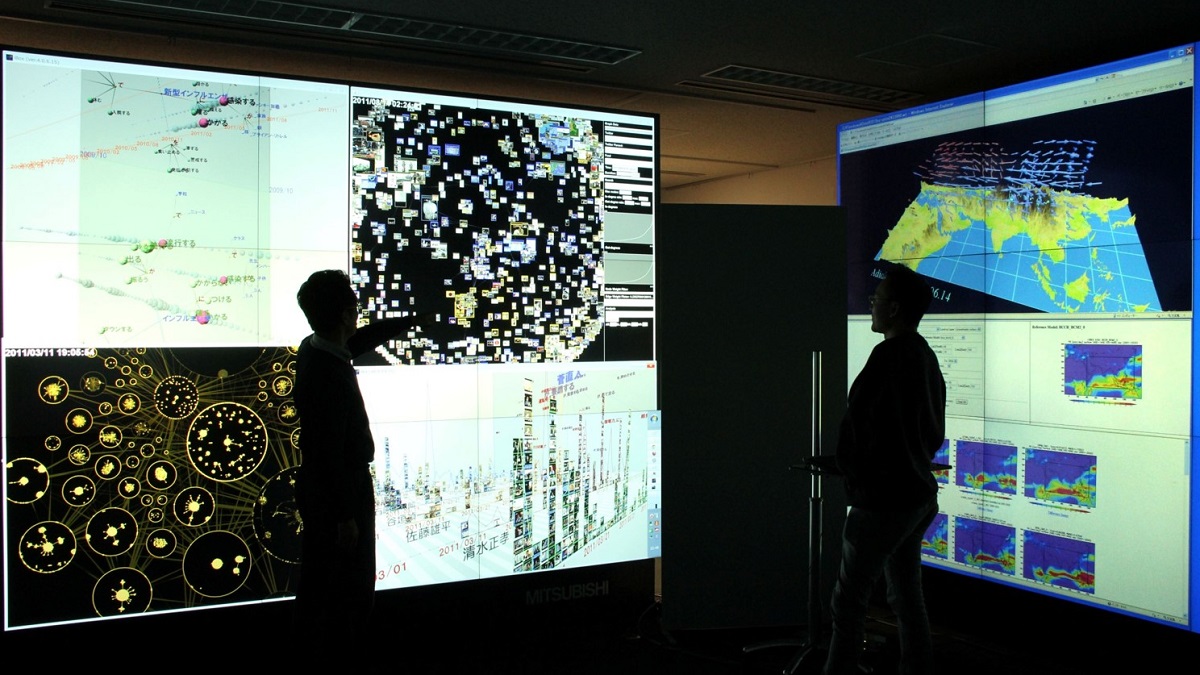
The digital world is filled with information being transmitted by individuals and sensors connected to the internet, offering valuable insights into the state of the world at any given moment. This information serves as a mirror of the real world, and within this vast amount of digital data lie valuable clues that make it possible to analyze and visualize social trends and forecast the future. Building on this concept, Professor Masashi Toyoda of the Institute of Industrial Science, The University of Tokyo is exploring methods to harness the ever-growing volume of data that accumulates daily in digital space. Toyoda has proposed methods using data from social media to estimate various figures, such as the number of positive COVID-19 cases that will arise and the degree of attendance at various types of events, as well as techniques for visualizing the results of data analyses. How are such estimates made possible? And how will visualizing these various forms of data contribute to society? We spoke with Toyoda to find out.
Visualizing the Extent of the COVID-19 Pandemic through Tweets
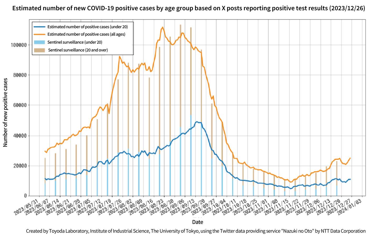
Fig. 1 Comparison of the number of new positive cases of novel coronaviruses estimated from X posts with the actual number measured by fixed-point ascertainment at medical institutions May 2023 was the time when the classification of novel coronavirus infections was moved to ‘category 5’ (moved on 8 May). After that date, the total number of positive cases was no longer ascertained, and the total number of positive cases was counted only once a week based on fixed-point ascertainment at some medical institutions. Posts reporting positive tests (including PCR, antigen tests and self-tests using kits) are extracted using a simple language pattern and fitted (i.e. matching the scale of the numbers) to the number of new positive cases.
Credit: Masashi Toyoda Laboratory
The line graph in Figure 1 presents an estimate of the number of new COVID-19 cases based on Japanese-language posts on X (formerly Twitter) during the period from May 2023 to January 2024. The bar graph shows actual figures according to sentinel surveillance by designated medical institutions for the same period, verifying that the total number of positive cases (orange) and the number of positive cases among those under 20 years old (blue) closely align with the estimates. Professor Toyoda, who carried out the analysis, explains.
“We searched through all Japanese-language posts to extract those reporting positive test results and applied statistical processing to produce these estimates. We extracted the posts using pattern matching, a method of searching for specific linguistic patterns. The process entails more than simply looking for keywords like ‘positive.’ It is essential to identify all the various ways that people phrase the message that they have ‘tested positive.’”
Toyoda is also attempting to apply similar analytical techniques to other infectious diseases, such as influenza and streptococcus. When designated medical institutions perform sentinel surveillance, the results take time to compile, often resulting in delays of more than a week between data collection and public notification. On the other hand, estimates based on analyzing posts can be generated on a daily basis, making them a valuable tool for quickly identifying trends in positive case numbers.
In addition to estimating the number of new positive cases, Toyoda has also been analyzing various other aspects of the COVID-19 pandemic. He worked to visualize behavioral trends as infections continued to spread using posts on X, including how risk-taking behaviors such as attending drinking parties decreased or increased in response to changes in new case numbers. He also estimated shifts in high-risk locations by analyzing mobile phone location data in correlation with new case numbers, such as how high-risk areas for residents of Setagaya City shifted from major business districts to within the city itself over the period from the third to fifth waves. Furthermore, he analyzed how pro-vaxxers and anti-vaxxers expressed that certain social media posts resonated with them, and how their opinions evolved over time, noting that posts from healthcare professionals had a particularly strong influence.
Predicting Event Attendance and Proposing Services in Anticipation of Demand
The above examples relating to an infectious disease demonstrate how the vast stream of personal Tweets generated daily can be leveraged to analyze and predict social phenomena. Toyoda has been exploring means of applying big data in a similar way to a wide range of other topics, with another key example being the prediction of event attendance. Specifically, he has been developing methods to forecast the timing and scope of attendance at sports games, concerts, exhibitions, and other gatherings by analyzing posts on social media platforms like X.
“Posts like ‘I’m going to the Giants game at Tokyo Dome tomorrow’ or ‘There’s an exhibition at a such-and-such place on a such-and-such date’ are common on X and other platforms. We developed a neural network model that predicts event attendance based on posts like these alongside data on population fluctuations during past events, which records the actual number of people present at specific times. This model has demonstrated the ability to predict the scale and timing of crowds at events in advance with a high degree of accuracy.”
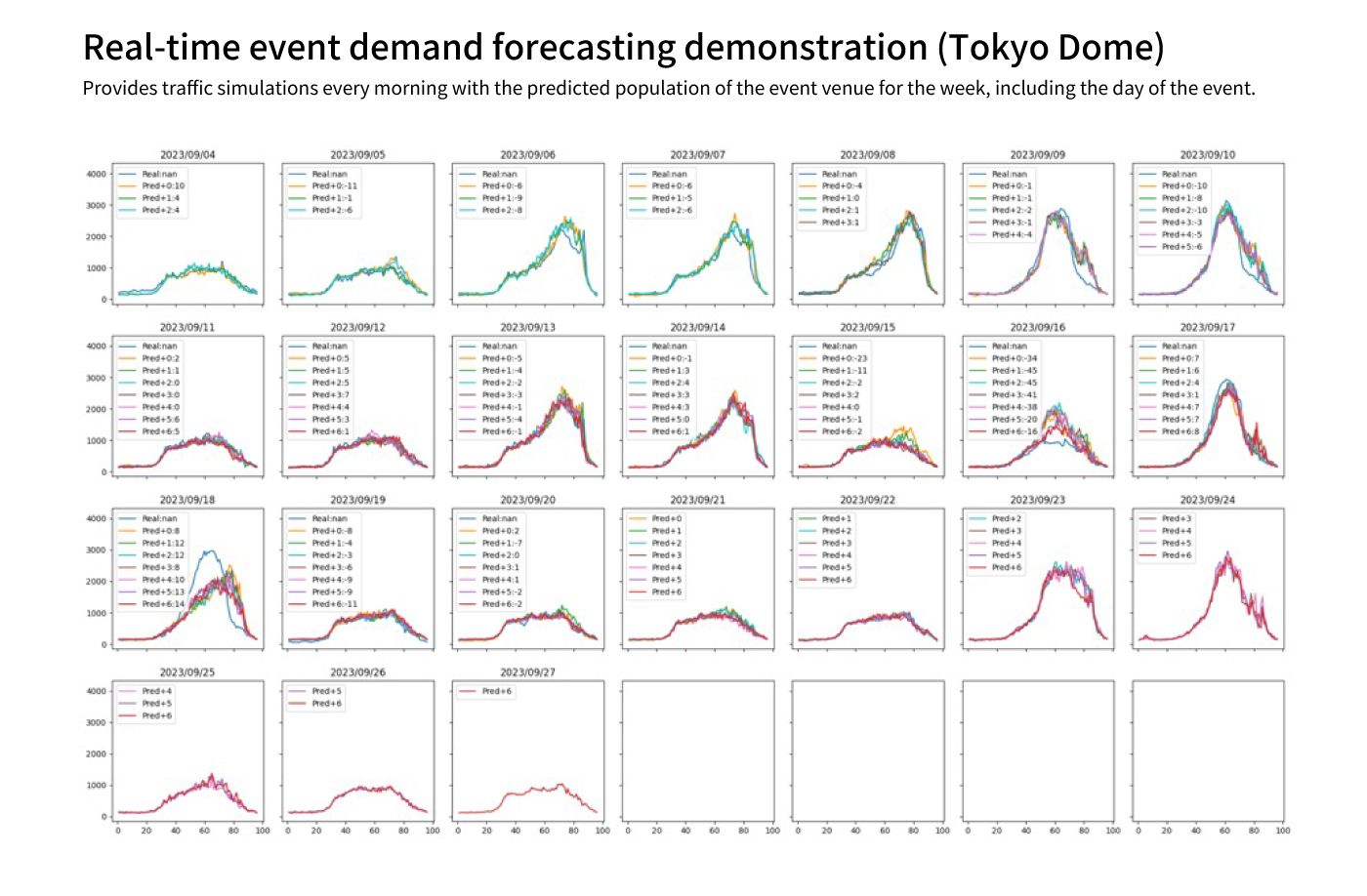
Fig. 2 Model-predicted population at Tokyo Dome for each time period on each date; for each graph from 4-20 Sept, the measured values (blue) are superimposed on the predicted values from up to a week earlier; from 21 Sept onwards, only the predicted values are shown; for events with a past example, such as a sports match, the predictions can be made with an error of about 10%. Predictions can be made with an error margin of about 10% for events with previous examples, such as sports matches (the size and time of irregular events can easily be wrong). This data can also be used to predict congestion in the surrounding area and traffic in advance.
Credit: Masashi Toyoda Laboratory
“When an event draws a large crowd, the nearest stations and train lines become congested. That’s why we are exploring the idea of introducing a new type of commuter pass that would allow users to take alternative routes without paying extra on days when heavy crowds are expected, as a means of easing congestion on trains and at stations. A panel survey experiment revealed that many people would be willing to use detours, so this kind of commuter pass could prove to be effective.”
Using a similar approach, it may also be possible to develop a framework for predicting congestion at tourist destinations to recommend less crowded alternatives. Another possible application is in the advertising field. Since age groups and demographic profiles of attendees vary among different types of events, digital signage could be used to tailor advertisements in surrounding areas based on these predictions. Toyoda has begun exploring this possibility as well.
Can the Impact of Trump’s Tariffs Be Visualized?
The technologies being developed by Toyoda have the potential for application in a broad range of fields. To leverage this vast potential for the good of society as a whole, the Institute for Digital Observatory was established at The University of Tokyo in 2023. The institute was founded with the mission of “observing” (hence the word “observatory” in the name) various social and economic activities around the world through digital data, and making the resulting analyses and insights accessible for use by governments and businesses. Currently, as its first major initiative, research is underway to enhance the resilience of global supply chains. Toyoda is taking part as the leader of a team focused on developing foundational technologies that make it possible to observe a wide range of social activities, and working toward building a system that visualizes the global flow of goods and services.
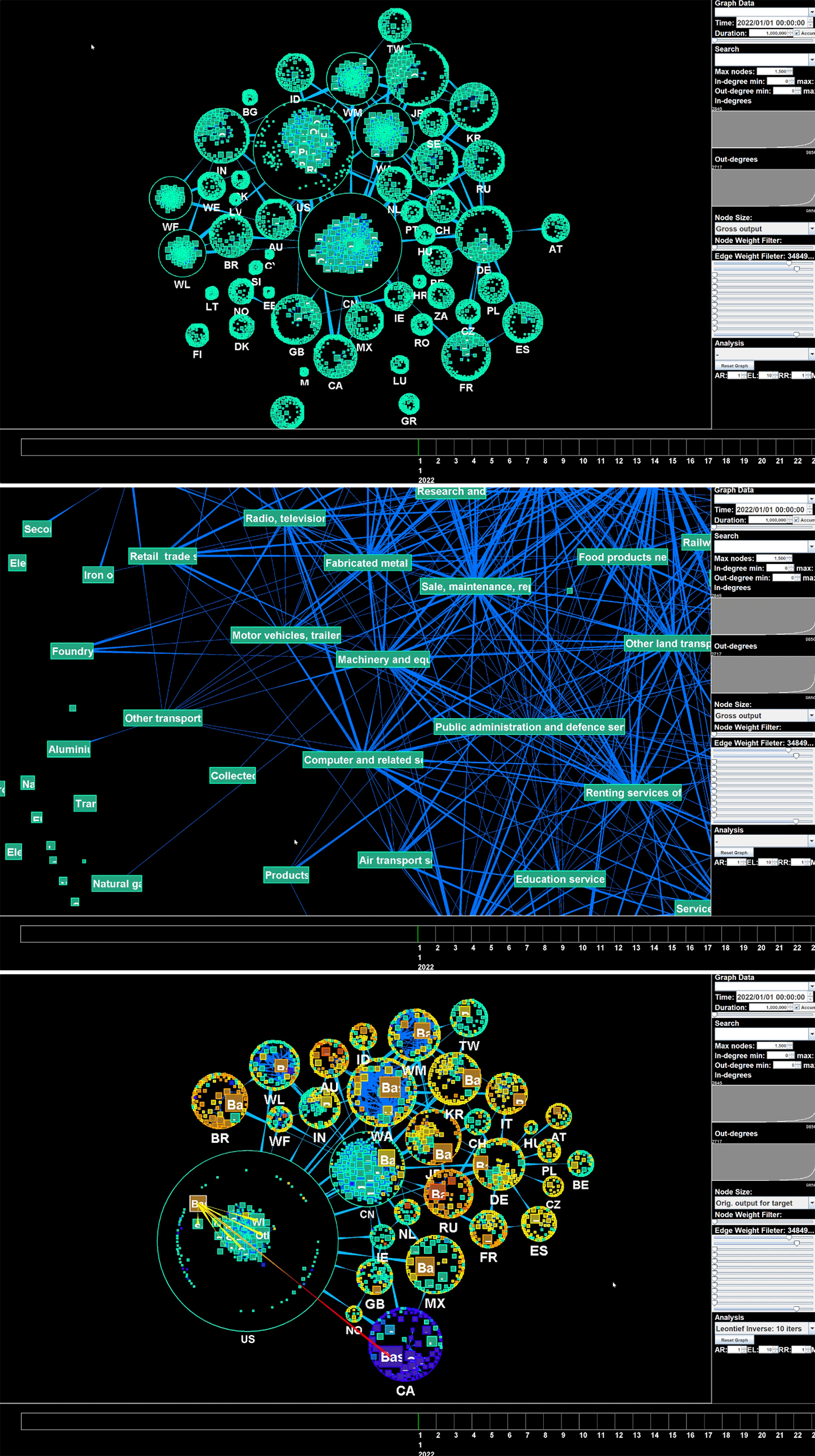
Visualisation of data from the “Input-Output table”. Each circle in the above diagram represents a country and the blue line represents the movement of goods and services (from thick to thin). The middle diagram zooms in on the USA (“US” in the above diagram). It depicts the links between the various industries in the country. The bottom diagram focuses on the US steel industry. The size of each country's circle expresses the extent to which the US steel industry depends on each country. In addition, if it is assumed that the US stops imports from Canada as a result of a 50% tariff on steel only to Canada (CA), the degree to which the US is forced to rely on countries other than Canada is represented by the intensity of the yellow colour. Countries such as Russia (RU), Brazil (BR) and Mexico (MX) are coloured darker. Translated with DeepL.com (free version)
Credit: Masashi Toyoda Laboratory
“The term ‘input-output table’ refers to data indicating the volume of raw materials sourced by each industry, which industries are supplying the materials, as well which industries are purchasing products and services, along with their sales volumes. We have developed a system that visualizes a global-scale input-output table and enables interactive analyses. In the upper portion of Figure 3, each circle represents a country, and the blue lines connecting them illustrate the flow of goods and services. As a specific example, the middle portion of Figure 3 shows a zoomed-in view of the United States (U.S.). Various industrial sectors are displayed within the country to visualize how they are interconnected and how goods and services move between them.”
U.S. tariff policies are currently disrupting the global economy, and the lower portion of Figure 3 presents a simulation of how production volumes in various countries would change if the U.S. were to impose a 50% tariff on steel imports from Canada alone, based on statements by President Trump in March 2025. This simulation assumes that steel exports from Canada to the U.S. would simply come to a complete halt, likely resulting in the U.S. (the large circle on the lower left) increasing its reliance on other countries to make up for the loss of Canadian imports (in the bottom center), with the degree of dependence indicated by the intensity of the yellow shading.
“To apply this in making real-world policy decisions, we would need experts in each field to help by incorporating more detailed conditions and data. My role is to develop the foundational technology that enables this sort of visualization and analysis. Now that nearly everything is being recorded in the digital world, the importance of these technologies has grown significantly.”
Beyond Data Visualization: A Brighter Future for Humans and Computers
Toyoda has been involved in information visualization research ever since his student days. Today, he describes his area of expertise as “interactive data analysis,” a process of analyzing and visualizing data, then using the insights gained to perform further analyses in an ongoing loop––a truly interactive method of analysis. The technology used to visualize the input-output model mentioned earlier is a perfect example of this. What, then, does the future hold beyond these analytical technologies? Toyoda offers his perspective.
“With the rapid pace of advancements made in AI, we are now facing––with increasing frequency––situations in which we have no choice but to rely on AI-generated results without fully understanding the reasoning behind them. I believe that, under these circumstances, it is essential to visualize various types of data and the results of analyses in a way that humans can clearly understand, and that enables us to logically trace the reasons for the outcomes and identify what they reveal. I intend to continue exploring new methods of visualization in order to achieve this. I believe this will lead to a future in which humans and computers are able to coexist in a more meaningful and beneficial way.”
Comments
No comments yet.
Join by voting
How did you feel about the "Possible Future" depicted in this article? Vote on your expectations!
Please visit the laboratory website if you would like to learn more about this article.
Share